A Prototype is Worth a Thousand Slides
A good prototype can illustrate product vision, prove technical feasibility, let you experience the journey, and evoke emotion through UI design and animation – all at once. A slide deck can usually do only one of these well before it starts diluting the narrative or disappearing into the weeds. Prototypes don’t just explain – they persuade.
Building a prototype also forces you to bridge the gap between concept and reality. You can put a “how might we” sentence on a slide – but in a prototype, it has to be answered. You might not get it right first time, but you’ll have already found a way through the problem. And you’ll have something tangible to test straight away.
Types and purposes of prototypes
There are different reasons for building a prototype. Sometimes you’re proving something is technically possible. Other times you want to experience how a journey flows over time. Maybe you need alignment around a product vision across teams. Or you’re fine-tuning interactions and motion to make the experience feel “delightful”.
You don’t always need a super high-fidelity, fully interactive prototype.
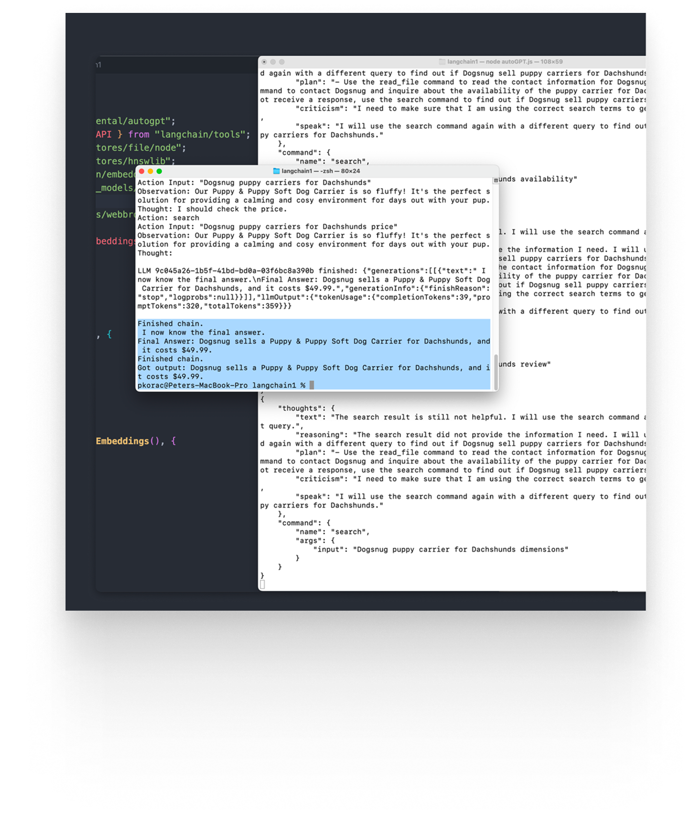
Technical POC (proof of concept)
The ugliest, most utility-focused prototype is often the most valuable: the technical proof of concept. These are great for proving something is technically possible or figuring out how you’d implement it. They can be built quickly and are often used to explore new technologies or de-risk unknowns.
To interact with a POC, you might need the terminal. If there’s a UI at all, it’s usually whatever gets you moving fastest – an off-the-shelf library like Shadcn or NuxtUI.
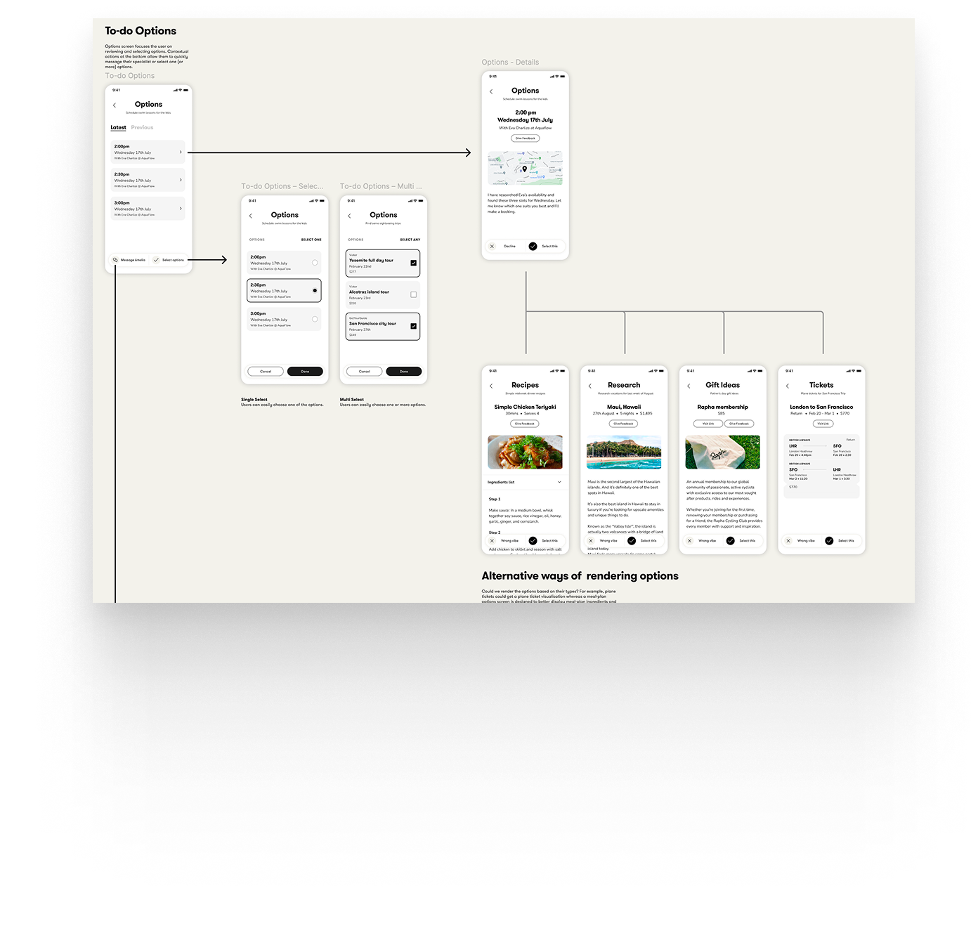
Figma click-through
When you’re trying to quickly understand how a user journey fits together, a Figma click-through can be the fastest route. Even simple rectangles with labels can be enough to get a rough sense of information architecture and flow.
I find these extremely useful in a collaborative team setting. They’re quick enough to build for everyone, easy to iterate on, and people tend not to get too precious because the roughness is the point.
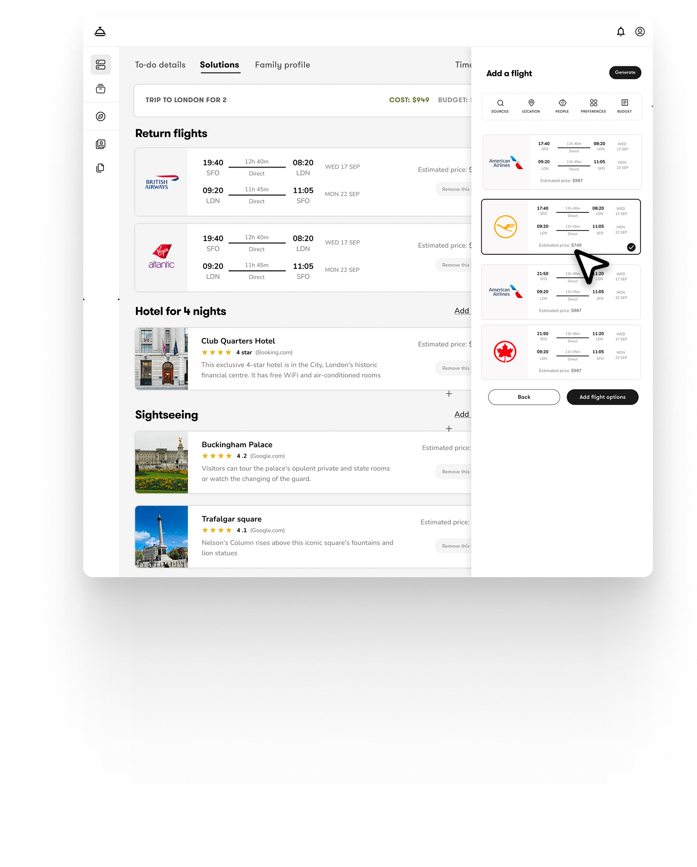
Fully interactive (coded) prototype
These are the bread and butter of my work. They don’t just show how a journey fits together – they let you experience the complexity of interacting with data through micro-interactions, modals, overlays, loading states, and motion.
Fidelity depends on time, resources, and purpose. If we’re exploring functionality (for example, how data manipulation should work), we’ll often start with “function first” and add polish later. Many of my prototypes begin that way.
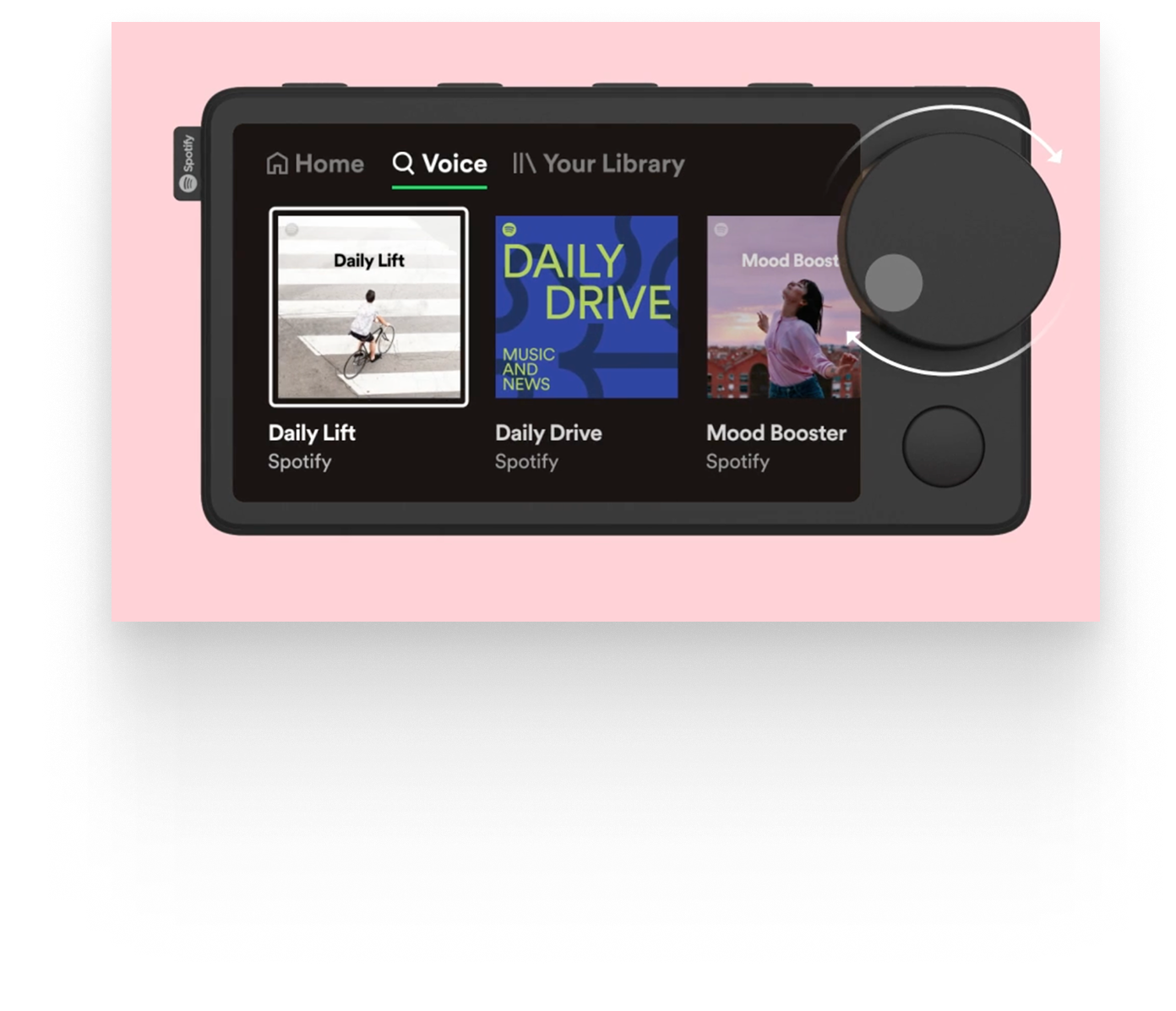
But if the goal is to nail a specific interaction, we’ll crank up the craft. When working on Spotify’s in-car device, for example, we spent serious time on how the dials felt – their weight, resistance, scroll distance, and the timing of feedback.
High-fidelity motion vignette
These can be built in code or using tools like Figma or Framer. Their purpose is usually to experience a single interaction in full detail. Visuals, motion, branding, and copy all matter here.
One example I worked on this year was a prototype of a search box. The goal wasn’t “search works” – it was to feel how suggestions appear, results arrive, and the component transforms as you move between modes.
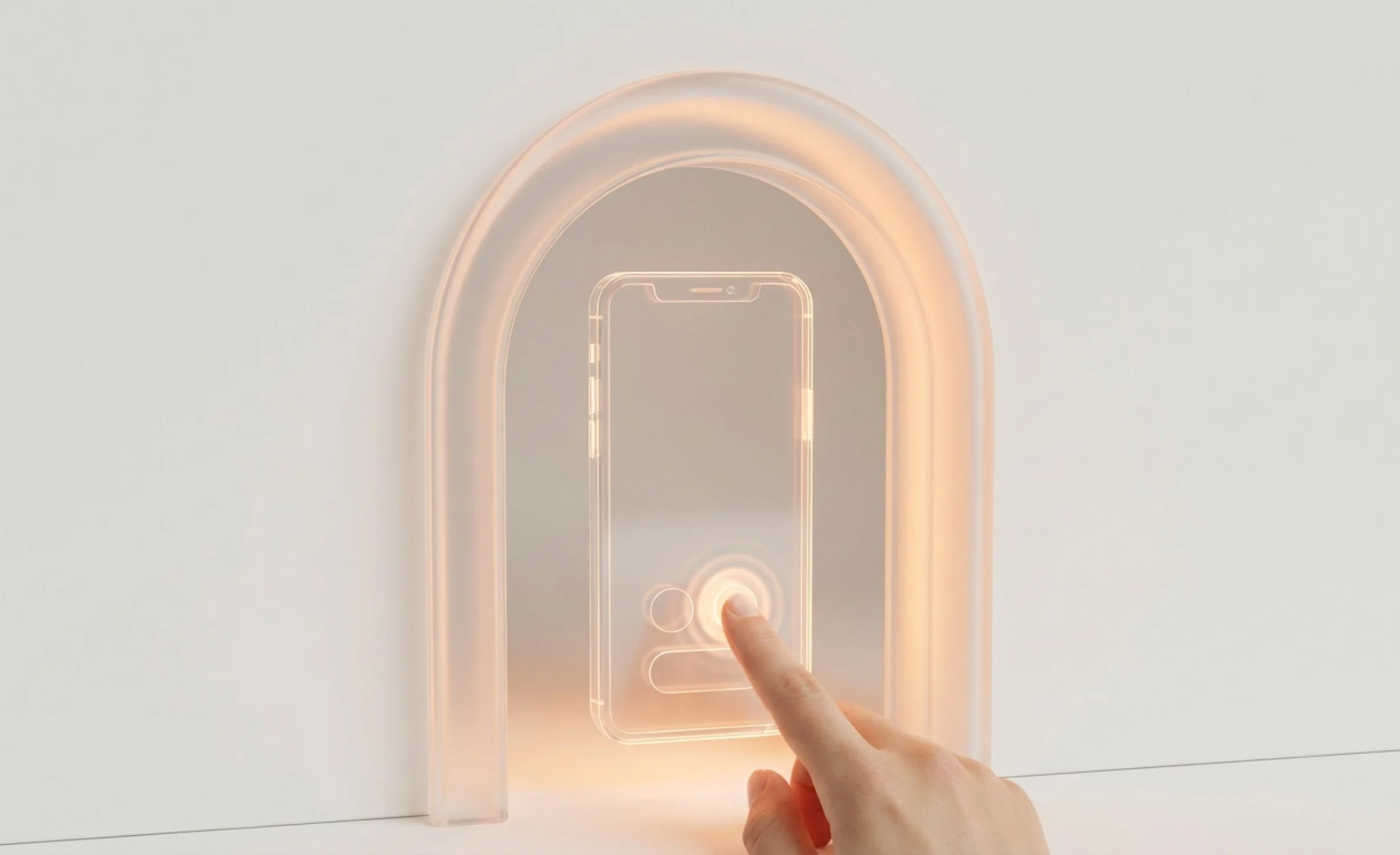
Vibe-coding (updated Feb 2026)
Agentic coding tools have become amazing. I’ve mostly been using tools like Lovable to build lots of small prototypes – either to test functionality or to explore a specific micro-interaction. For example, I built a multi-turn chatbot prototype (think Slack DMs with an AI bot added) to quickly experience different conversation flows.
That would take much longer to code from scratch. But because these are “throw-away” prototypes, they don’t need production hardening, tests, edge-case handling, or all the other stuff that makes real software… real.
I’ve been very cautious about claims that these tools can ship production-ready apps. However, over the last month the improvements in code quality I’m seeing with Codex, Cursor and Claude Code’s outputs are pretty close.
Pitfalls of prototyping
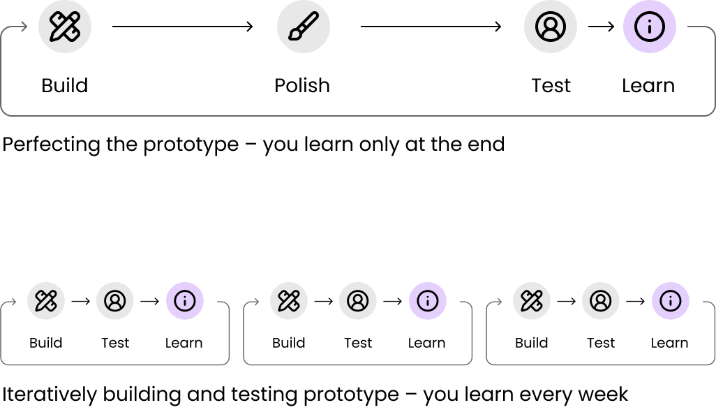
Perfecting prototypes
Some teams have the urge to keep polishing a prototype for weeks until it feels "finished" instead of testing a cruder prototype with users. That's usually a trap – you're sacrificing learning for polish.
Prototypes are meant to help you learn quickly. They can be rough. They can be thrown away once they’ve served their purpose. Perfecting a prototype often wastes time that could be better spent iterating, testing, and learning.
A rough rule of thumb: if you’re no longer adding functional or learning value, and you’ve spent more than a week tweaking language or visuals, you’re probably not prototyping – you’re building a polished demo or the app itself.
No onboarding or setup
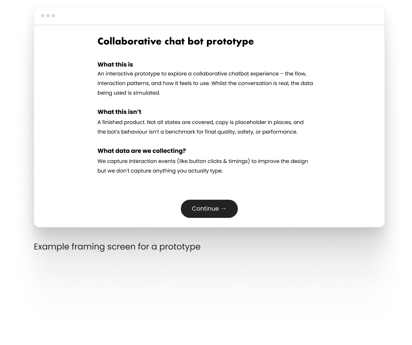
When sharing prototypes with others a bit of framing can prevent hours of confusion. An intro screen that explains what the prototype is (and isn’t) can set people up for success and save you from derailed conversations and misaligned feedback later on.
If you’re testing the prototype as if it were a real app, a lightweight onboarding is also useful – not to gather loads of data, but to get the participant into the right mindset.
Staying too low fidelity
Some prototypes – especially vision prototypes – need to do more than “work”. They need to also tell a story and communicate confidence, taste, and coherence. Here you are building a polished demo and staying too low fidelity can work against you. However, I would err on the side of caution – it’s very easy to over-egg it and spend too much time on the story and not enough on product.
Where slide decks win over prototypes
Slide decks can frame a story and control a narrative far better than a prototype. I’ll almost always start client check-ins with a few slides to set context:
what we’re doing (and why)
what we’ve done so far
what we’ll review today (and what we won't)
what’s next
Then we move into the prototype.
Slides are also great for explaining complex concepts through diagrams, schematics, and systems thinking – especially when you need to zoom out and show the bigger picture.
And yes: slides are easier to share in the long run. A PDF survives time, inboxes, and corporate IT. Prototype links expire, break, or turn into a “works on my machine” folk tale.
Outro
In 2026 there’s no excuse anymore not to start with prototypes. We’ve got amazing design libraries, vibe-coding tools and integrations that make it trivial to jump straight into “how we might'“ instead of of staying on the level of “how might we”.
I’m a big fan of storytelling with slides. Slides are great for framing a conversation, crafting the narrative, and making sure we’re solving the right problem for the right reasons.
But when the goal is to make a decision – fund this, prioritise that, commit a team, change direction – a prototype does something slides can’t. It collapses the distance between “what we mean” and “what it feels like”. It turns imagining ideas into reacting, and debating them with tangible evidence.
And the nice thing is you don’t need the perfect brief to get there. If you’re a stakeholder not sure what to request from a design team, ask for "something I can click".